How to create custom forms with validation and scroll to invalid logic in React Native (Part three: Improvements)
October 07, 2019
Originally posted at: medium.com/lawnstarter-engineering
In the last part of this series, I’ll go over some ways we can further improve our custom validation forms and share some final thoughts on handling forms in React Native.
Fragments
When we first started building our custom forms, Fragments had not yet landed in React Native - so we needed to handle inputs within nested views by applying the scroll to invalid logic to the wrapping View itself, something we touched on in part two. While this workaround solved our issues completely, it was not always the most elegant solution, especially if our input had additional elements above it within the nested view - which then required us to set an offset amount to the location of the element on the screen.
Fortunately, the Fragment element is now available to alleviate this issue.
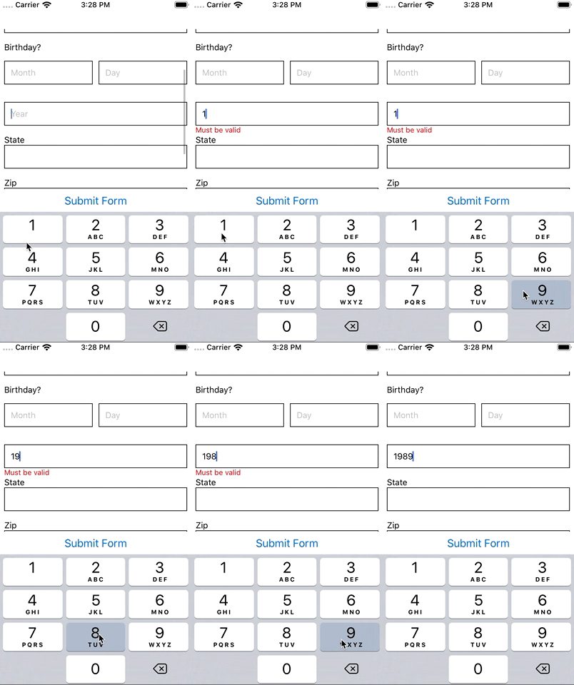
Looking back at our demo app, if we wanted to add a input to capture the birth year of our user, and nest it within the same View as our other birthday inputs - it would look something like this:
<View
  onLayout={({ nativeEvent }) => {
    this.setInputPosition({
      ids: ["birthday_month", "birthday_day"],
      value: nativeEvent.layout.y
    });
  }}
>
  <Text>Birthday?</Text>
  <View style={styles.split}>
    // month and day inputs here
    <TextInput />
    <TextInput />
  </View>
  <View
    onLayout={({ nativeEvent }) => {
      this.setInputPosition({
        ids: ["birthday_year"],
        value: nativeEvent.layout.y
      });
    }}
  >
    <TextInput
      style={styles.input}
      placeholder="Year"
      onChangeText={value => {
        this.onInputChange({ id: "birthday_year", value });
      }}
    />
    {this.renderError("birthday_year")}
  </View>
</View>
As we’ve mentioned, the issue here is that our helper methods would detect the input position of the birthday_year View within the context of the parent birthday_month, birthday_year View. Now, with the help of Fragment, we can swap out the parent View with an element whose sole purpose is to wrap other elements, without providing any styling - which is exactly what we need in this situation.
<Fragment>
  <Text>Birthday?</Text>
  <View
    onLayout={({ nativeEvent }) => {
      this.setInputPosition({
        ids: ["birthday_month", "birthday_day"],
        value: nativeEvent.layout.y
      });
    }}
    style={styles.split}
  >
    // month and day inputs here
    <TextInput />
    <TextInput />
  </View>
  <View
    onLayout={({ nativeEvent }) => {
      this.setInputPosition({
        ids: ["birthday_year"],
        value: nativeEvent.layout.y
      });
    }}
  >
    <TextInput
      style={styles.input}
      placeholder="Year"
      onChangeText={value => {
        this.onInputChange({ id: "birthday_year", value });
      }}
    />
    {this.renderError("birthday_year")}
  </View>
</Fragment>
If you’re still following along with the demo app, it looks like this at the moment.
Touched
Another improvement I would highly recommend is to add the concept of “touched” to your inputs. Currently, if a user starts to enter 1989 in the birth year input, they’ll see a validation error as soon as they’ve entered in the very first character, because 1 falls out of the acceptable range we’ve setup between 1900 and 2019. While this is technically correct, it is a poor user experience to see validation errors when you haven’t yet finished typing.

To handle this issue, we’re going to introduce the concept of “touched” - so our validation will only trigger after the first time a user interacts with an input and then moves on to the next input. To do this properly without making a mess of our form, we’ll first create a FormInput component to house a lot of this logic in a repeatable way.
import React, { Component, Fragment } from "react";
import { StyleSheet, Text, TextInput, View } from "react-native";

export default class FormInput extends Component {
  constructor(props) {
    super(props);
    this.state = {};
  }

  renderError() {
    const { errorLabel } = this.props;
    if (errorLabel) {
      return (
        <View>
          <Text style={styles.error}>{errorLabel}</Text>
        </View>
      );
    }
    return null;
  }

  render() {
    const { label } = this.props;
    return (
      <Fragment>
        <Text>{label}</Text>
        <TextInput style={styles.input} {...this.props} />
        {this.renderError()}
      </Fragment>
    );
  }
}

const styles = StyleSheet.create({
  input: {
    borderWidth: 1,
    borderColor: "black",
    padding: 10,
    marginBottom: 15,
    alignSelf: "stretch"
  },
  error: {
    position: "absolute",
    bottom: 0,
    color: "red",
    fontSize: 12
  }
});
Now that we’ve abstracted our general form inputs into a reusable component, we’ll be able to add some functionality to them in a cleaner and more reusable way. This is how our form currently looks using this new component.
The first thing we’ll want to do is setup local state in our FormInput to house the touched state.
this.state = {
  touched: false
};
Next, we’ll want to update the error handler to only render if the input has been touched.
  renderError() {
    const {errorLabel} = this.props;
    if (errorLabel && this.state.touched) {
      return (
        <View>
          <Text style={styles.error}>{errorLabel}</Text>
        </View>
      );
    }
    return null;
  }
And finally, we’ll want to use the built-in onBlur prop on our TextInput to update our local state whenever a user taps away from the input.
  // make sure to bind this to the constructor
  onBlur() {
    this.setState({
      touched: true,
    });
  }

  // then add the prop
  <TextInput style={styles.input} {...this.props} onBlur={this.onBlur} />
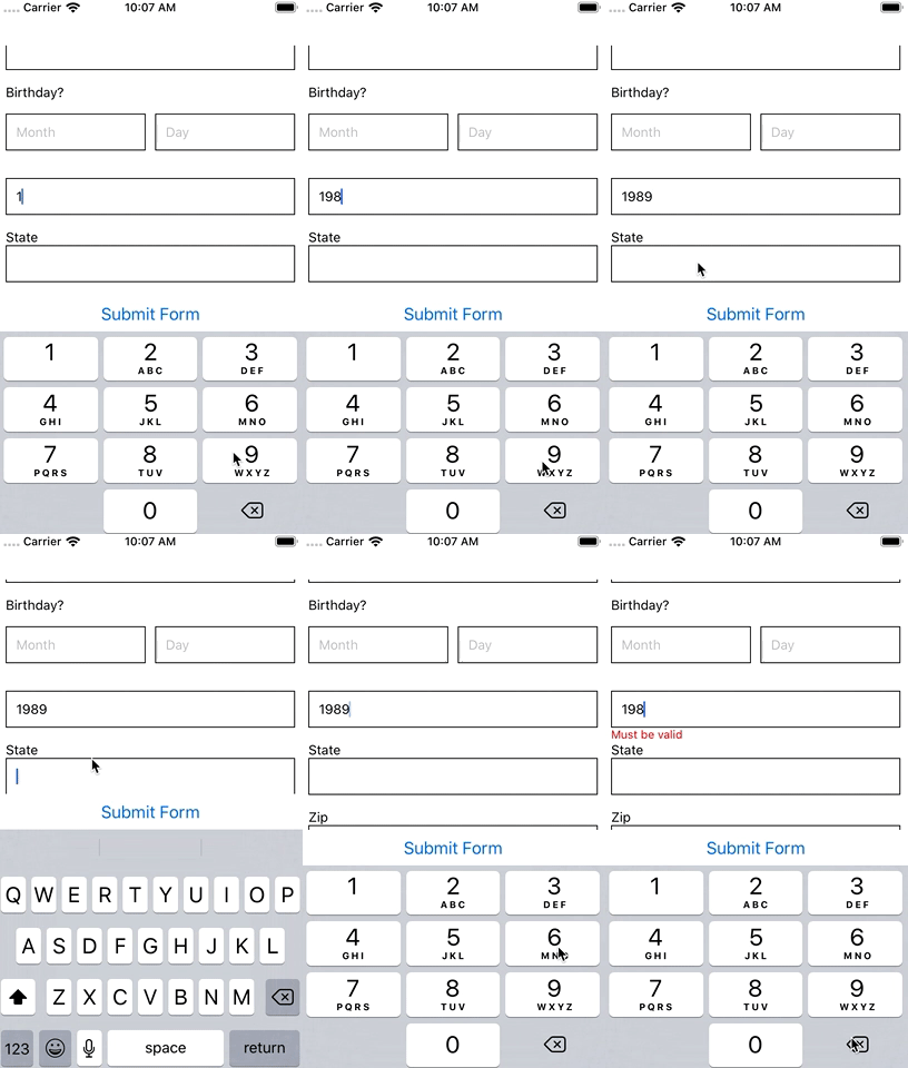
Now that we have that setup, let’s see how our input now handles entering in a year.

Great. We now validate the input after the first blur - so any subsequent edits will highlight any issues that may be present.
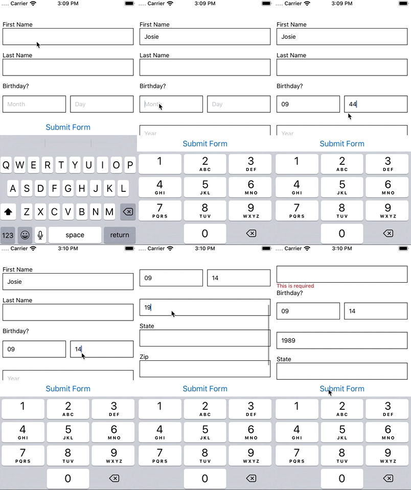
Now, what if the user skips an input entirely and clicks submit? The input would be invalid since it’s required, but our error message would not display because the internal state of our input is still flagged as un-touched.
To handle this, we’re going to add the concept of a touched state to the parent form for each individual input, and handle most of the logic in our validation helpers.
First, we’ll update our error rendering to look for the touched prop OR the touched flag in state.
const { errorLabel, touched } = this.props;
if (errorLabel && (touched || this.state.touched)) {
  // render error
}
Next, we’ll update each use of our FormInput component to accept a touched prop.
<FormInput
  touched={inputs.first_name.touched}
  // existing props
/>
And finally, we’ll need to update two methods in our validation helpers. The first one is getInputValidationState. We want to add touched as a parameter and have it return that value OR the value set to state of the individual input.
function getInputValidationState({ input, value, touched }) {
  return {
    ...input,
    value,
    errorLabel: input.optional
      ? null
      : validateInput({ type: input.type, value }),
    touched: touched || input.touched
  };
}
And then we’ll need to update getFormValidation - so that when we call getInputValidationState within it, we will force the touched flag to be true. It will look like this:
function getFormValidation() {
  const { inputs } = this.state;

  const updatedInputs = {};

  for (const [key, input] of Object.entries(inputs)) {
    updatedInputs[key] = getInputValidationState({
      input,
      value: input.value,
      touched: true
    });
  }

  this.setState({
    inputs: updatedInputs
  });

  return getFirstInvalidInput({ inputs: updatedInputs });
}
This way, when a user clicks submit - we’ll ensure that the touched flag is forced to truthy for every input - which will reflect in our input’s individual validation state if they are invalid thanks to the new prop.
That’s it - now your forms will validate, without being annoying to the end user. To see all the changes we’ve made in this section, go here.
 All wrapped up, our form looks like this.
Libraries
If rolling your own form validation isn’t something you’re interested in, you may have luck using a library to assist you. Recently, the ecosystem for handling forms on React Native has begun to expand. There are quite a few options out there - none of which we’ve personally tested but they are worth mentioning nonetheless.
You may have luck with a solution such as Redux Form, React Final Form, or Formik. For a walkthrough on these three options - check out this video. You could also check out React Hook Form - this one is a bit newer but the demo looks fantastic.
You may also consider using a supplemental library such as react-native-scroll-into-view, which looks like it could simplify some of the trickier scroll-to-invalid that we’ve covered.
And finally, I’ve gone ahead and setup the demo repo to export the helper methods - so you can import react-native-form-helpers into your project for ease of use. Feel free to submit any feedback or PRs on it.
Final Thoughts
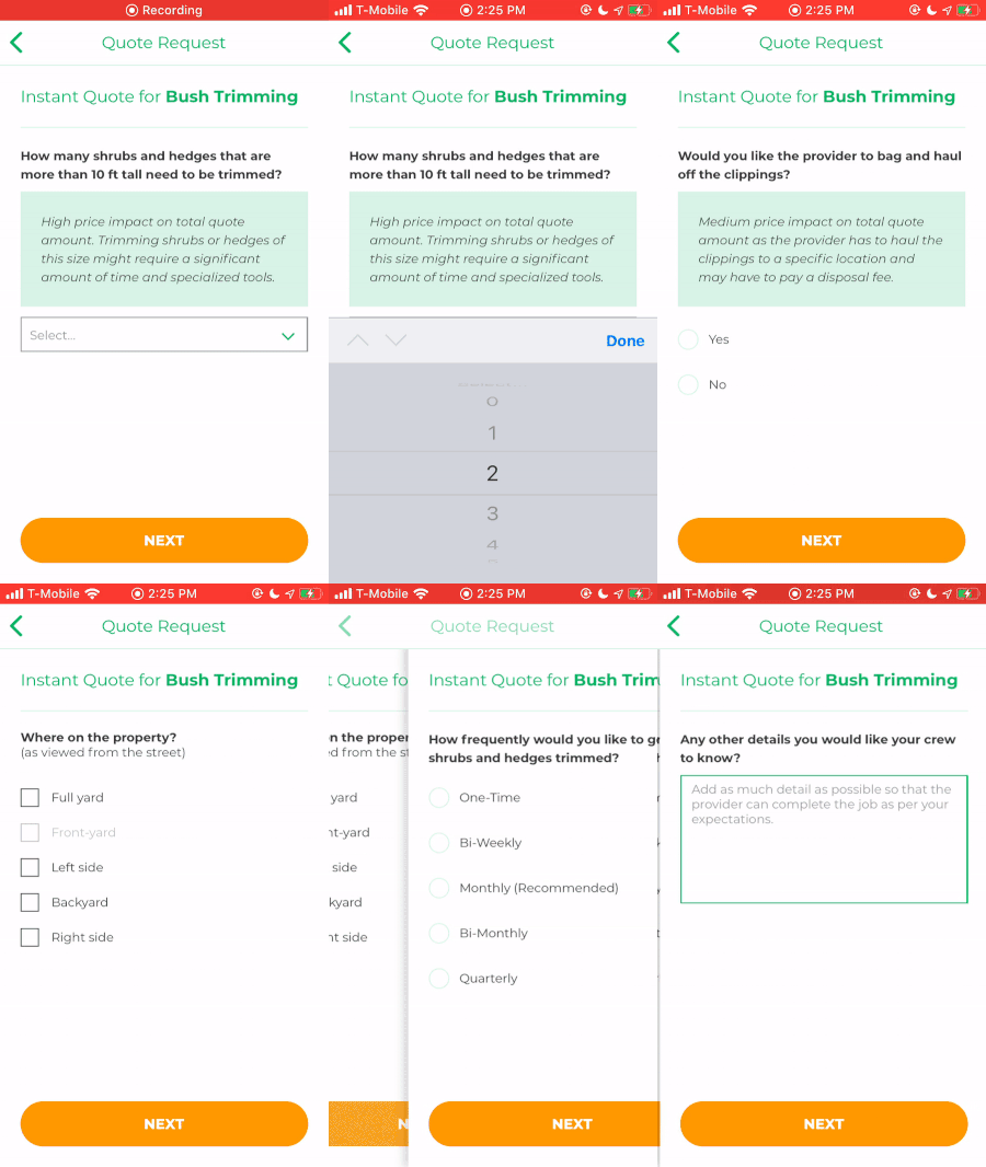
At first launch of our React Native apps, our design team was relatively non-existent, which led our engineers to lead decisions in our design and user experience. Since that time, both our design and engineering teams have grown and we’ve begun to move away from the scroll-to-invalid pattern in our forms, replacing them with multi-screen flows. While the validation logic lives on - we believe the pains of filling forms on a mobile device are better alleviated by providing a small subset of questions that will fit within one screen at a time.

There are certainly pros and cons to both sides of this argument and your app may very well benefit from having longer forms on your side. It’s certainly worth having a conversation around and deciding on what’s best for the end user with consideration to the engineering resources available on your team.
Thanks for following along on this three part tutorial. Feel free to share any feedback or questions below.